http://ask.xmodulo.com/plot-bar-graph-gnuplot.html
This tutorial discusses ways to draw a bar graph on Gnulot.
Assume that you have the following data file, from which you want to create a bar graph.
If you want to plot a bar graph in black-and-white patterns, use the following Gnuplot script instead.
Download this article as ad-free PDF (made possible by your kind donation):
Question: How can I create a bar graph (bar chart) using Gnuplot?
A bar graph is a plot which visualizes data values using
proportional-size bars. Bar charts are useful when you want to compare
multiple items among different categories. As you can imagine, they are
much more effective than a table of numerical data.This tutorial discusses ways to draw a bar graph on Gnulot.
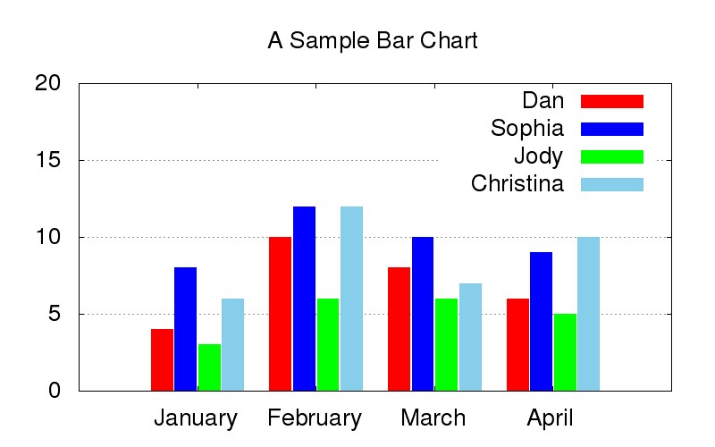
Assume that you have the following data file, from which you want to create a bar graph.
#         Dan      Sophia   Jody     Christina
January   4        8        3        6
February  10       12       6        12
March     8        10       6        7
April     6        9        5        10
The following Gnuplot script generates a bar graph using the above data file.
set terminal png size 800,500 enhanced font "Helvetica,20"
set output 'output.png'

red = "#FF0000"; green = "#00FF00"; blue = "#0000FF"; skyblue = "#87CEEB";
set yrange [0:20]
set style data histogram
set style histogram cluster gap 1
set style fill solid
set boxwidth 0.9
set xtics format ""
set grid ytics

set title "A Sample Bar Chart"
plot "bar.dat" using 2:xtic(1) title "Dan" linecolor rgb red, \
            '' using 3 title "Sophia" linecolor rgb blue, \
            '' using 4 title "Jody" linecolor rgb green, \
            '' using 5 title "Christina" linecolor rgb skyblue
If you want to plot a bar graph in black-and-white patterns, use the following Gnuplot script instead.
set terminal png size 800,500 enhanced font "Helvetica,20"
set output 'output2.png'

set yrange [0:20]
set style line 2 lc rgb 'black' lt 1 lw 1
set style data histogram
set style histogram cluster gap 1
set style fill pattern border -1
set boxwidth 0.9
set xtics format ""
set grid ytics

set title "A Sample Bar Chart"
plot "bar.dat" using 2:xtic(1) title "Dan" ls 2, \
            '' using 3 title "Sophia" ls 2, \
            '' using 4 title "Jody" ls 2, \
            '' using 5 title "Christina" ls 2
Download this article as ad-free PDF (made possible by your kind donation):

No comments:
Post a Comment