http://xmodulo.com/matplotlib-scientific-plotting-linux.html
If you want an efficient, automatable solution for producing high-quality scientific plots in Linux, then consider using matplotlib. Matplotlib is a Python-based open-source scientific plotting package with a license based on the Python Software Foundation license. The extensive documentation and examples, integration with Python and the NumPy scientific computing package, and automation capability are just a few reasons why this package is a solid choice for scientific plotting in a Linux environment. This tutorial will provide several example plots created with matplotlib.
To install matplotlib in Debian or Ubuntu, run the following command:
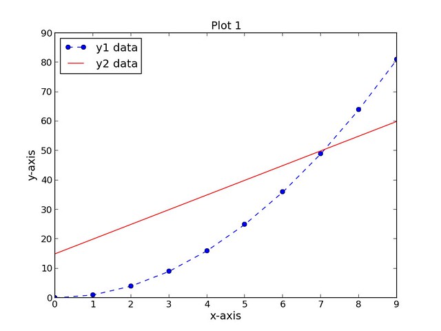
The resulting plot is shown below:
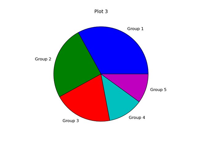
The resulting plot is shown below:
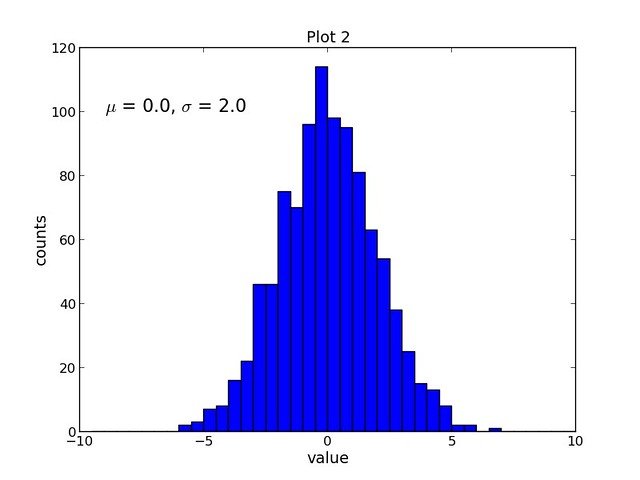
The resulting plot is shown below:
If you want an efficient, automatable solution for producing high-quality scientific plots in Linux, then consider using matplotlib. Matplotlib is a Python-based open-source scientific plotting package with a license based on the Python Software Foundation license. The extensive documentation and examples, integration with Python and the NumPy scientific computing package, and automation capability are just a few reasons why this package is a solid choice for scientific plotting in a Linux environment. This tutorial will provide several example plots created with matplotlib.
Features
- Numerous plot types (bar, box, contour, histogram, scatter, line plots...)
- Python-based syntax
- Integration with the NumPy scientific computing package
- Source data can be Python lists, Python tuples, or NumPy arrays
- Customizable plot format (axes scales, tick positions, tick labels...)
- Customizable text (font, size, position...)
- TeX formatting (equations, symbols, Greek characters...)
- Compatible with IPython (allows interactive plotting from a Python shell)
- Automation - use Python loops to iteratively create plots
- Save plots to image files (png, pdf, ps, eps, and svg format)
Installation
Installation of Python and the NumPy package is a prerequisite for use of matplotlib. Instructions for installing NumPy can be found here.To install matplotlib in Debian or Ubuntu, run the following command:
$ sudo apt-get install python-matplotlib
To install matplotlib in Fedora or CentOS/RHEL, run the following command:
$ sudo yum install python-matplotlib
Matplotlib Examples
This tutorial will provide several plotting examples that demonstrate how to use matplotlib:- Scatter and line plot
- Histogram plot
- Pie chart
1
2
| import numpy as npimport matplotlib.pyplot as plt |
Example 1: Scatter and Line Plot
The first script, script1.py completes the following tasks:- Creates three data sets (xData, yData1, and yData2)
- Creates a new figure (assigned number 1) with a width and height of 8 inches and 6 inches, respectively
- Sets the plot title, x-axis label, and y-axis label (all with font size of 14)
- Plots the first data set, yData1, as a function of the xData dataset as a dotted blue line with circular markers and a label of "y1 data"
- Plots the second data set, yData2, as a function of the xData dataset as a solid red line with no markers and a label of "y2 data".
- Positions the legend in the upper left-hand corner of the plot
- Saves the figure as a PNG file
1
2
3
4
5
6
7
8
9
10
11
12
13
14
| import numpy as npimport matplotlib.pyplot as pltxData = np.arange(0, 10, 1)yData1 = xData.__pow__(2.0)yData2 = np.arange(15, 61, 5)plt.figure(num=1, figsize=(8, 6))plt.title('Plot 1', size=14)plt.xlabel('x-axis', size=14)plt.ylabel('y-axis', size=14)plt.plot(xData, yData1, color='b', linestyle='--', marker='o', label='y1 data')plt.plot(xData, yData2, color='r', linestyle='-', label='y2 data')plt.legend(loc='upper left')plt.savefig('images/plot1.png', format='png') |
Example 2: Histogram Plot
The second script, script2.py completes the following tasks:- Creates a data set containing 1000 random samples from a Normal distribution
- Creates a new figure (assigned number 1) with a width and height of 8 inches and 6 inches, respectively
- Sets the plot title, x-axis label, and y-axis label (all with font size of 14)
- Plots the data set, samples, as a histogram with 40 bins and an upper and lower bound of -10 and 10, respectively
- Adds text to the plot and uses TeX formatting to display the Greek letters mu and sigma (font size of 16)
- Saves the figure as a PNG file
1
2
3
4
5
6
7
8
9
10
11
12
13
| import numpy as npimport matplotlib.pyplot as pltmu = 0.0sigma = 2.0samples = np.random.normal(loc=mu, scale=sigma, size=1000)plt.figure(num=1, figsize=(8, 6))plt.title('Plot 2', size=14)plt.xlabel('value', size=14)plt.ylabel('counts', size=14)plt.hist(samples, bins=40, range=(-10, 10))plt.text(-9, 100, r'$\mu$ = 0.0, $\sigma$ = 2.0', size=16)plt.savefig('images/plot2.png', format='png') |
Example 3: Pie Chart
The third script, script3.py completes the following tasks:- Creates data set containing five integers
- Creates a new figure (assigned number 1) with a width and height of 6 inches and 6 inches, respectively
- Adds an axes to the figure with an aspect ratio of 1
- Sets the plot title (font size of 14)
- Plots the data set, data, as a pie chart with labels included
- Saves the figure as a PNG file
1
2
3
4
5
6
7
8
9
| import numpy as npimport matplotlib.pyplot as pltdata = [33, 25, 20, 12, 10]plt.figure(num=1, figsize=(6, 6))plt.axes(aspect=1)plt.title('Plot 3', size=14)plt.pie(data, labels=('Group 1', 'Group 2', 'Group 3', 'Group 4', 'Group 5'))plt.savefig('images/plot3.png', format='png') |

No comments:
Post a Comment